How to Paint Realistic Flames: The Trick You Need to Know!

Horizontal banner with bold text overlay reading 'How to Paint Realistic Fire – Tricks and Tips' with flame graphics and a painted fire miniature in the background

Ever painted a flame and ended up with something that looked more like a blob of ketchup and mustard than fire? You’re not alone. Painting fire can be deceptively tricky. Many painters instinctively highlight the outer tips, but real flames glow brightest at the core.

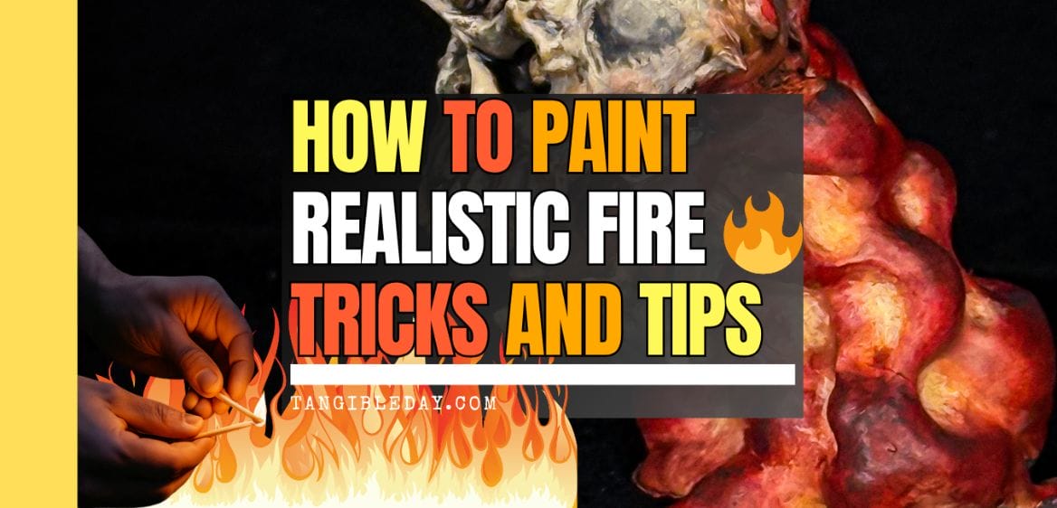
In this guide, I’ll walk you through the one trick that changed how I paint fire: thinking like a heatmap. This approach uses realistic gradients—white-hot centers fading to cold charred edges—to create convincing fire effects on miniatures. I’ll show you exactly how this works, step-by-step, using a 3D printed skull miniature with sculpted flame elements, and a flat paint swatch to demonstrate blending techniques.

Vertical Pinterest-style banner showing a painted skull miniature with fire effects and text reading 'How to Paint Realistic Fire: The Trick You Need to Know.'

1. Understand the Flame Shape

If your model already has flames sculpted into it, you’re in luck. That gives you a natural guide for painting. In this example, I used a 3D printed miniature that has twisting flames curling around a skull base. These flame shapes rise and twist, giving you the perfect opportunity to apply the heatmap effect.

3D printed resin miniature skull with flames
A resin 3D printed skull using my Elegoo Mars printer.

🔥 Tip: Painting fire realistically is easier when the sculpt gives you cues about where the “hottest” parts should be (usually the inner recesses).

Painted female miniature with swirling flame base, shown against a black background to highlight glowing fire effects.
Using the basic concept for painting fire, applying contrast in a hot to cold “heat map” with color helped me create this glowing flame effect on this model. Notice the black “soot” at the edges? Black, or any dark-ish color close to a black-tone represents the coldest aspects of the flame. Whereas the brightest areas read visually as the heat source.

2. Use Real Fire as Your Color Reference

Before you start painting, pull up a few photos of real fire. I like to use both campfires and glowing coals as references.

Glowing red-orange coals in a round fire pit, used as color and lighting reference for painting fire.
I took this photo of my fire pit. It was the perfect reference image for what I wanted to show in this tutorial. Notice bright to dark values? The hot parts are “deep”. The cool parts are close to the edges or surfaces away from the source of heat.

You’ll notice something important:

  • Bright white-yellow at the hottest point
  • Intense oranges surrounding the core
  • Rich reds tapering off
  • Black or deep shadows around the edges

You can see what I mean below and in the photos.

Small campfire with yellow-white center and orange flames rising into the air, used as a real-world fire reference.
You can find images all over the internet to help you understand how to paint things.

This creates a clear temperature roadmap for your paintjob. Use it as a guide when building your color transitions on the miniature.


3. Choose Your Heatmap Palette

On your palette, line up your colors from hottest to coolest:

The kind of acrylic hobby paint you use will depend on your personal preference. It’s not necessarily the brand that matters, but rather the color saturation (e.g., how red is your red color) and the value (e.g., how bright is your color) that matter. For this example, I’m using the all-purpose affordable paint set from The Army Painter and a few other brands.

For the most part, you’ll want acrylic hobby paints that dry matte (not shiny) and have good coverage when applied evenly. The color shouldn’t streak, or reveal brush strokes at a normal seeing distance (~8 or more inches away) with 3-4 thin coats of paint.

RELATED: TOP 10 PAINT SETS FOR PAINTING MINIATURES AND MODELS

I like to mix shades directly on a bright, white-colored palette. This let’s me see the colors and vibrancy right away before I start applying the paint. You can use a wet palette or dry palette—It doesn’t matter. Use whatever you’re comfortable with.

Plastic paint palette with drops of bright red and orange paint prepared for fire effect blending.
I’ve been testing out this white silicon paint palette from Turbo Dork. I kind of love it. But, does it rival my Jack Richeson prorcelain glazed palette? I am not so sure. Here’s a full review of all the “dry” palettes I’ve tested over the years.

🎨 Tip: Avoid pure white except in the smallest highlight spots. Let a bright, yellow-white dominate the core of the flame for a more natural look.


4. Practice Your Gradient on a Flat Surface First

Before touching the mini, I always practice the gradient on a flat swatch. It’s an easy way to understand how the colors shift and where they should land. Using the heatmap logic:

  • Start from any end, red or yellow, with orange in the center
  • Blend between colors
  • End with white and black at either end (hot or cold side)
Flat color swatch showing blocked red, orange, and yellow paint labeled with 'Hot' and 'Cold' for fire effect temperature mapping.
The basic triad of yellow, orange, and red form the core colors for fire.
Close-up of a hand using a brush to apply white paint at the center of a red-yellow gradient swatch labeled 'Hot'.
The hot side will be brightest, with a close-to-white colored paint.
Hand painting black onto the edge of a red-yellow gradient swatch labeled 'Hot to Cold' to simulate soot and cooling flame edges.
At the coldest side, black is painted to simulate the gradient that fire creates wihtin its environment.

Practice blending between the color swatches. I do this by mixing two colors to create the middle tone. For example, take a bit of red and orange, mix, to create an red-orange. Apply this red-orange color over the border between the red and orange base coat.

Here’s a video I made showing how to blend paint colors with “layering”. It’s fast, simple, and probably the easiest method for blending colors without the need for advanced brush skills, e.g., wet blending, glazing.

Squeeze bottle adding black paint to a palette already containing red, orange, and yellow shades for fire painting.
I mix my paints in the palette to create the transistions between colors. Make sure to allow each base color to dry before applying and blending a layer on top. This will save you from so many headaches and annoying streaks.
Brush mixing black and red paint in a palette to create darker transition tones for flame edge blending.
To blend paint, I mix 1:1 ratios of two colors. This “middle color” is applied over the border of the two colors I want to bloend. Here is the mix of red and black paint.
Brush dipped in off-white paint next to red, yellow, and orange tones on a mixing palette for fire painting.
A mixture of white and yellow creates the middle color I will use to blend between the pure yellow and white base coats.

Tip: What helps a lot is if you allow each color to dry before applying another layer on top.

This blend helps train both your eye and brush. These same transitions can then be applied directly to your miniature.

Completed swatch showing a smooth gradient from white to black across yellow, orange, and red, labeled 'Hot' to 'Cold'.
After a rough blend between colors, from white to black, you can see how the heatmap is created. The hot side is brightest. The cold side is darkest. This is the BIG trick you’ll want to internalize when painting realistic fire.

💡 Key Idea: This is the one trick—treat fire as a gradient from hot to cold, and paint in that direction. Black is cold. White is hot.


5. Apply the Heatmap to the Miniature

Now transfer that logic to the model. On the skull miniature, I began by placing yellow at the deepest parts of the flames. Use a simple base coat technique.

Miniature painted with fire effect from deep red to white, placed among assorted hobby paints on a cluttered workbench.
Using the same idea, you can apply “hot” and “cold” colors to your model. It’ll look messy to start, even ugly… but that’s OK.
Skull miniature in progress with vivid yellow and red flame blending, held above a paint palette with wet paint pools.
Slowly build up the color gradients like you would do on a flat surface. For those who are new to painting on 3D sculpted miniatures, this could take some time. Practice blending and be patient. This process can take hours and hours.
Close-up of flame-textured miniature showing rich red and yellow blends to simulate internal glow.
But, with practice, you’ll get faster and your blends will look more natural. Remember, it’s okay to be messy, as long as the colors are placed in the correct place. Hot should be bright (e.g., white or bright colors). Cool should be darker (e.g., dark reds to black).

Then I blended outwards with orange and red, using the same approach from the flat swatch. Finally, I darkened the flame tips and areas near the skull with a bit of black to represent cooling.

Flame effect miniature with bright yellow core areas and red outer edges, surrounded by bottles of hobby paint.
Keep blending. This still requires quite of bit of work. And, the black paint hasn’t been really added yet. I keep going and slowly build up the colors until…. it looks like fire.

🔥 Pro Tip: Reinforce the hottest spots as needed to boost contrast. A strong center glow makes the flames look intense and natural.


6. Refine and Push Contrast

At this stage, stop and evaluate. Are the yellows still bright? Are the transitions smooth?

Finished skull miniature with completed red and black flame effects, positioned on a painting handle at a cluttered workstation.
We’re almost there…I’m pretty happy where this is going.

If things are muddy:

  • Reapply yellow or white to the hot zones
  • Glaze orange or red to blend transitions
  • Use a thin black glaze to cool off overly bright edges

You can always touch up your flat swatch to compare. I did this while checking my watch—layering takes time, but it’s worth it.

Flat swatch showing smooth blend from white to black through yellow, orange, and red, labeled 'Hot' to 'Cold', with brush applying black paint.
I refer to the heat map when I need it. Save this photo if it is helpful for you.

7. Compare Your Mini to Your Heatmap Swatch

One of the most helpful things I do is compare the painted mini to the practice swatch. When they follow the same temperature logic, the effect just works. You’ll see that glow, and your flame will feel alive.

Paint swatch card showing a smooth heatmap gradient from white to black through yellow, orange, and red, labeled 'Hot' and 'Cold'.
And, if you struggle, practice on a flat surface like I did when I was learning how to blend and create special effects.

8. Finishing Touches and Photography

For the final presentation, I took photos of the painted mini against a black backdrop. This really sells the effect.

Finished miniature of a flaming skull painted with red and yellow gradients, displayed against a black background.
The final paint job!
Realistic outdoor campfire with bright white-yellow core and orange flames rising above twigs in a dark forest setting.
Fire.

Good lighting enhances the flame effect.

RELATED: TIPS FOR PHOTOGRAPHING MINIATURES

Soft shadows and dim surroundings allow the colors to stand out more vividly. The finished model reads clearly, with the hottest colors inside and the coolest, darkest tones on the outside.

Painted miniature of a female mage surrounded by sculpted flame effects on a circular base, lit against a black background.
Now, apply this same technique to any miniature you want. And, for those of you who are curious, yes, you can now paint flames in different colors, e.g., green fire, blue fire… just think about the “heat map”. Hot is bright. Cold is dark.

Conclusion: Paint Fire Like a Heatmap

To paint realistic flames, focus on how the colors are placed—not just the colors themselves.

Use a heatmap mindset: begin with the white-hot core and blend outward to yellow, orange, red, and finally blackened edges. Following this gradient helps your fire effects look alive and full of energy.

Give this method a try and tag me in your results. I’d love to see your flames come to life!

Enjoying Your Visit? Join Tangible Day

Free newsletter with monthly updates (no spam)

Leave a comment! Follow on X, Instagram, and Facebook.

Free photo backdrop bundle for miniature photography
Grab your FREE photo backdrop bundle for miniature photography in the shop.
Set of metal polyhedral dice for tabletop roleplaying games
135 Unique Hobby Gift Ideas: Fast 2 Days or Less Shipping!
Tabletop miniatures and wargaming accessories from Etsy sellers
Blick Masterstroke sable paintbrush for miniature painting

Tangible Day on YouTube (Miniatures and More!)

Tangible Day YouTube channel banner for miniature painting content

Leave a comment

This site uses Akismet to reduce spam. Learn how your comment data is processed.

Discover more from Tangible Day

Subscribe now to keep reading and get access to the full archive.

Continue reading